NDA Project
Loyalty App for Corporate Group —
Designing a wireframe user flow on Membership Tiers
To define how important for users to understand "membership tiers" in a loyalty mobile app

About.
Role
Product Designer
Timeline
Jan 23 — Apr 23
Tools & Relevant systems
Figma, Miro, Microsoft Azure, Cloudifier
Project Overview
To design a comprehensive loyalty mobile App with the goal of enhancing user engagement and loyalty across brands' malls & hotels from scratch. I worked on making membership tiers and points experience feel seamless and suit the needs of understanding upgrade or downgrade status for users. I learned lots being the core designer owning the membership tier and profile parts from Benchmarkings → Userflows → Wireframes → Discussed the considerations from developers and Cloudifier system → Revisions on wireframes → Prototypes. It was challenging but fun working with a team and collaborated with various stakeholders throughout the design and development process.
Problem Statement
How might we make membership tiers easier
for users to understand?
What users have to know about membership tiers:
Primary
1. Current tier
2. Total Points
3. Accumulated points to upgrade
Secondary
4. Keep grade & Downgrade requirements
5. Mission Points
6. Tier benefits

Challenge 1.
Is that possible to show all points information in the homepage?
Before
Given that our brief in the early stage was to show everything on the homepage, included
1. Spending Point
2. Mission Point
3. Current tier
4. Status on upgrade progress

Pros
-
Show most of the points information
-
Users can visualise the upgrade progress
Cons
-
Overwhelming points information
-
Users might not desire to upgrade rather than the points to redeem rewards
After
After letting stakeholders visualise the previous homepage version, we success to minimise the tier information on the homepage
1. Total points
2. Current Tier


Pros
-
Minimize the tier information
-
Focus on the user's needs, especially "how many points are left to redeem rewards?"
-
Show "View Upgrade Progress" on a slide-down lightbox to avoid overwhelming information for users
-
Reduce the points information ratio on first screen to allow more content to be shown
Challenge 2.
Complicate upgrade system


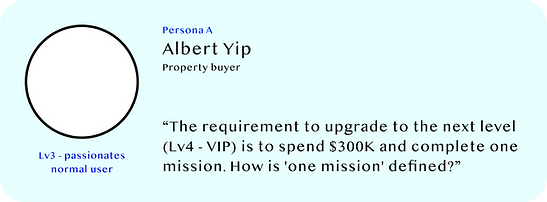
Personas.


I got Missions points!
-
If users have earned any mission points, both the Spending and Missions progress bars will be displayed
Ideations.
Take it easy!
-
On the Membership Tier page, Albert can track his upgrade progress bar at the top
-
Once the spending goal is completed, the Missions progress bar will take priority
-
The 0/1 Missions circle progress bar will only show up for users who have not yet earned any mission points


Employee edition!
-
We created a separate column for "Employee Missions" so that users won't mix up their personal points with their employee missions
Challenge 3.
How user know they might downgrade /
keep their grade (tier)?
Why last?
-
Our goal is to encourage users to upgrade their membership, rather than just maintaining their current grade or downgrading
-
'Membership Renewal' is a notice of lesser importance, intended to help users understand the criteria for membership renewal

Hierarchy.

Downgrade without notice? NO!
-
When there is only one month left until the membership renewal deadline, users will receive reminders via message box and light box notifications in their profile. So there is no need to worry!